
Creating a survey that reflects your brand identity should be a straightforward part of setting up a feedback channel.
Design Studio simplifies this process by bringing survey appearance settings into a single interface, allowing you to make design decisions, experiment with different visual arrangements, and see the results immediately.
This makes it easier to maintain visual consistency across channels, and make adjustments whenever your design needs change. With reusable themes and channel specific options, you can spend less time configuring survey appearances and more time preparing surveys for your respondents.
What You Will Find Here
This article covers:
- Accessing Design Studio
- Understanding the Design Studio Interface
- Selecting and Managing Survey Themes
- Customizing Your Survey Appearance
- Configuring Survey Settings
- Customizing Web Widget Appearance
- Using Custom CSS
- Previewing and Saving Your Design
- Completing Channel Setup
- FAQs
Accessing Design Studio
Design Studio is available as part of the channel configuration process in Pisano.
To access it:
- Open Channels from the main navigation menu.
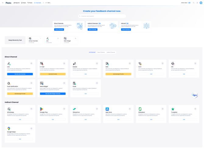
- Select the channel type you want to configure.
- Create a new channel or open an existing one.

- Proceed to Channel Settings.
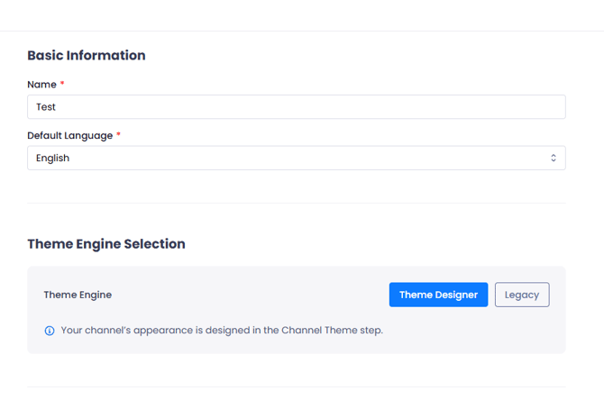
- Enter the channel name and select the default language under Basic Information.
- Under Theme Engine Selection, select Theme Designer.
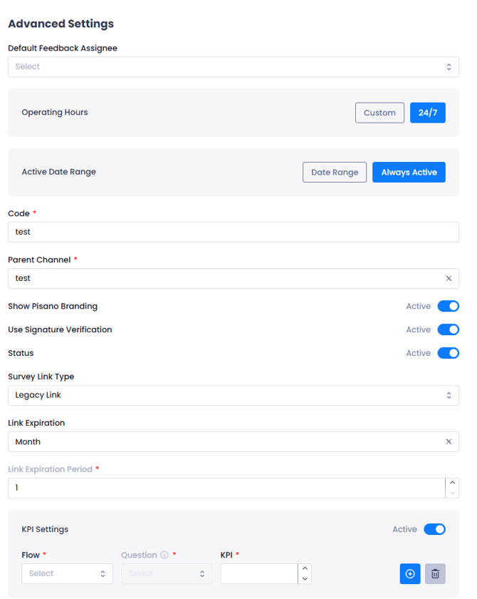
- Complete the remaining channel settings and continue to Select Flow.
- Select an existing Flow and click Continue
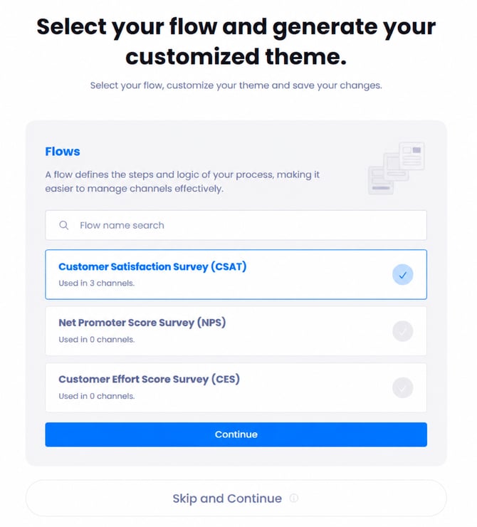
Or choose Skip and Continue to proceed without selecting one.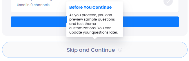
- Open the Channel Theme step to access Design Studio.
Notes
- Theme Designer is the new default theme engine. Legacy remains available for existing channels using the previous theme engine.
- Selecting a Flow allows you to preview its questions with your theme. If you skip Flow Selection, you can customize the theme using sample questions and update the survey later.
- Channel Settings may vary depending on the selected channel type.
Understanding the Design Studio Interface
Design Studio consists of three main areas that allow you to select, customize, and preview your survey's appearance.
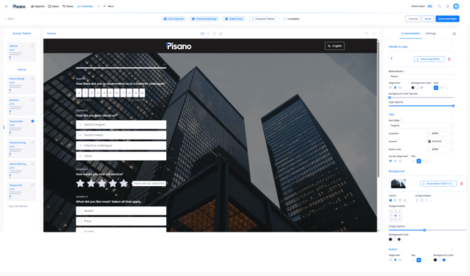
Survey Theme
The left panel displays the available survey themes, including the Default theme and previously saved themes.
Select a theme to use its existing visual settings as the starting point for your design.
Preview
The central area displays your survey with the selected theme and customization settings.
Changes made through the editor are reflected in the preview, allowing you to review the appearance of your survey as you work.
The toolbar above the preview includes controls for switching between device views, expanding the preview, and undoing changes.
Customization and Settings
The right panel contains the available customization controls.
The Customization tab includes settings for Header & Logo, Text, Background, and Button.
The Settings tab provides additional options for question numbering, progress indicators, alignment, branding, and Custom CSS.
For Web Widget channels, an additional Widget tab is available for configuring the launcher and survey window.
Selecting and Managing Survey Themes
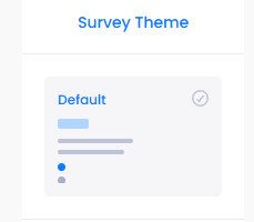
Design Studio provides predefined themes that you can select and customize according to your preferences. The Survey Theme panel supports up to 100 themes.
Selecting a Theme
To select a theme:
- Open the Survey Theme panel on the left.
- Review the available themes.
- Click the theme you want to use.
- Review its appearance in the Preview area.
- Use the Customization panel to make further adjustments.
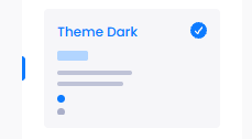
Reusing Saved Themes
Themes saved through Design Studio can be selected in other channels.
This allows you to maintain consistent survey designs across different feedback channels without repeating the same customization process.
Customizing Your Survey Appearance
The Customization tab contains the visual controls used to adjust your survey's appearance. Settings are organized into four sections.
Header & Logo
The Header & Logo section allows you to configure the branding displayed at the top of your survey.
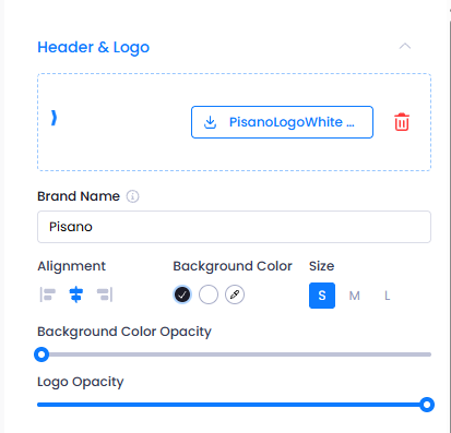
| Setting | Description |
| Logo | Upload a logo to display in the survey header. |
| Brand Name | Enter the brand name associated with the survey. |
| Alignment | Position the header content to the left, center, or right. |
| Background Color | Set the header background color. |
| Size | Select the size of the header content. |
| Background Color Opacity | Adjust the transparency of the header background. |
| Logo Opacity | Adjust the visibility of the uploaded logo. |
To customize your header, upload your logo, enter the brand name, and adjust the alignment, colors, size, and opacity using the available controls.
Your changes are reflected in the Preview area.
Text
The Text section allows you to adjust the typography, text colors, and alignment of your survey.
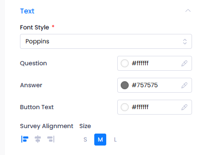
| Setting | Description |
| Font Style | Select the font used in the survey. |
| Question | Set the question text color. |
| Answer | Set the answer text color. |
| Button Text | Set the color of button text. |
| Survey Alignment | Align the survey content to the left, center, or right. |
| Size | Select the survey text size. |
Select your preferred font and configure the colors for questions, answers, and button text. You can use the color picker or enter hexadecimal color values for precise color selection.
Use Survey Alignment and Size to adjust the positioning and dimensions of the survey content.
Notes
- Make sure the selected text colors remain readable against the survey background.
- Review text size and alignment in different device previews.
Background
The Background section allows you to configure the background color, image, and layout of your survey.
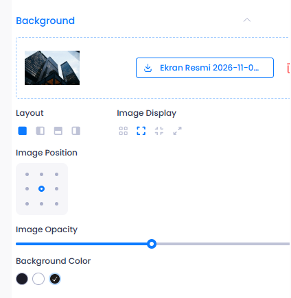
| Setting | Description |
| Background Image | Upload an image to use as the survey background. |
| Layout | Choose how the background and survey content are arranged. |
| Image Display | Configure how the uploaded image fits within the available area. |
| Image Position | Adjust the position of the background image. |
| Image Opacity | Control the transparency of the background image. |
| Background Color | Set the survey background color. |
To customize the background:
- Upload an image using the Background section.
- Select your preferred Layout.
- Adjust Image Display and Image Position.
- Use Image Opacity to control the image's visibility.
- Select a Background Color if needed.
- Review the changes in the Preview area.
Different Layout options allow you to arrange the survey content and background image in different ways.
You can also reduce Image Opacity to make survey questions easier to read over detailed backgrounds.
Button
The Button section allows you to customize the appearance and placement of survey buttons.
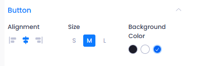
| Setting | Description |
| Alignment | Position buttons to the left, center, or right. |
| Size | Choose the button size. |
| Background Color | Set the button background color. |
Select the preferred alignment, size, and background color using the available controls.
To change the color of button labels, use the Button Text setting under the Text section.
Configuring Survey Settings
The Settings tab provides additional controls for how survey elements are displayed.
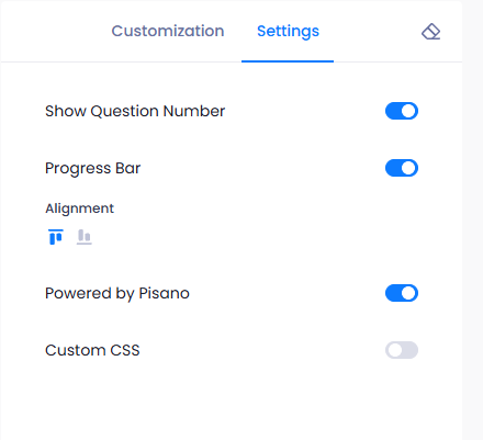
| Setting | Description |
| Show Question Number | Show or hide question numbers. |
| Progress Bar | Show or hide the survey progress indicator. |
| Alignment | Adjust the alignment of survey content. |
| Powered by Pisano | Control the visibility of Pisano branding. |
| Custom CSS | Enable additional styling through supported CSS rules. |
Use the available toggles and alignment controls to configure these options. Changes can be reviewed in the Preview area.
Customizing Web Widget Appearance
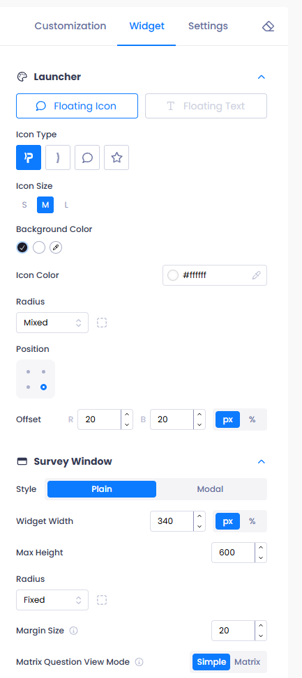
When using Design Studio with a Web Widget channel, the right panel includes an additional Widget tab.
This tab allows you to configure how the widget launcher and survey window appear on your website.
Launcher
The Launcher section controls the element visitors use to open the survey.
You can select a launcher type, such as Floating Icon or Floating Text, and configure its appearance using the available settings.
These include Icon Type, Icon Size, Background Color, Icon Color, Radius, Position, and Offset.
For example, you can choose a Floating Icon, adjust its size and colors, and position it in the bottom right corner of the page.
Survey Window
The Survey Window section controls the appearance and dimensions of the survey container.
You can select between Plain and Modal styles and configure Widget Width, Max Height, Radius, and Margin Size.
The Matrix Question View Mode setting also allows you to select between Simple and Matrix presentation modes.
These options help you adjust how the survey window is displayed within your website.
Notes
The Widget tab controls the launcher and survey window, while the Customization tab controls the appearance of the survey content.
Using Custom CSS
Design Studio provides visual controls for common design adjustments without requiring CSS knowledge.
For advanced customization requirements, you can enable Custom CSS from the Settings tab.
To use Custom CSS:
- Open the Settings tab.
- Enable Custom CSS.
- Open the CSS editor.
- Enter your styling rules using the supported properties and selectors.
- Review the changes in the Preview area.
- Click Save to save your CSS changes.
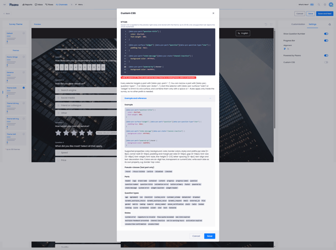
The editor provides reference information for supported CSS properties, selectors, question types, and survey states.
It also displays validation messages when CSS rules contain syntax errors or unsupported properties.
Notes
Custom CSS is optional and intended for advanced styling requirements. Standard appearance changes can be made directly through the visual controls.
Previewing and Saving Your Design
The Preview area allows you to inspect your survey before completing the channel configuration.
Previewing Different Device Sizes
Use the device icons above the Preview area to switch between available screen sizes.
Review your survey's typography, background, alignment, and buttons to ensure the design appears as intended.
You can also use the expand control to view the survey in a larger workspace.
Undoing Changes
Use the Undo Changes control above the Preview area to revert changes while editing your theme.
Saving Your Design
Once you have finished customizing your survey:
- Review the design using the available preview options.
- Click Save to save your changes.
- Click Save and Next to proceed to the Complete step.
Saved themes can be selected again when configuring other channels.
Completing Channel Setup
After saving your design and completing the channel configuration, Pisano displays a confirmation screen indicating that the channel and Flow setup has been completed successfully.
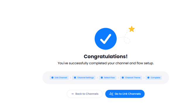
You can select Back to Channels to return to the main Channels page or use the channel specific navigation button to open the corresponding channel list.
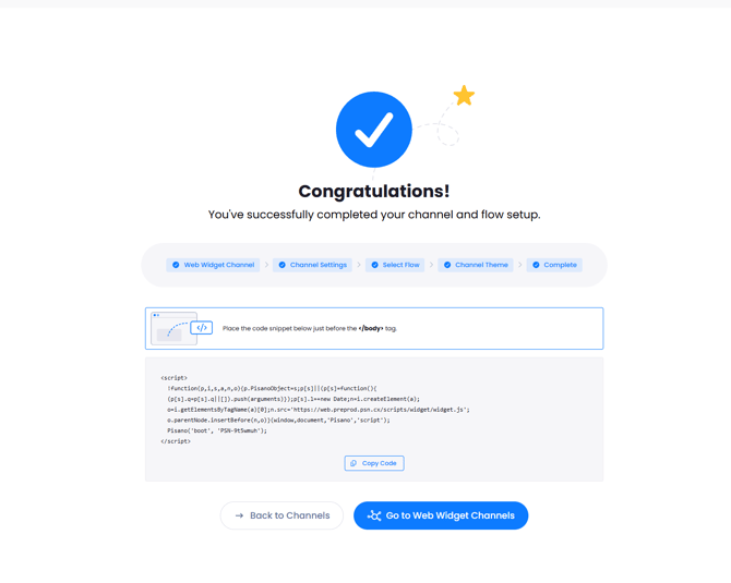
For Web Widget channels, the Complete screen also provides a JavaScript code snippet that must be added to your website to display the widget.
Click Copy Code and place the snippet immediately before the closing </body> tag in your website's HTML.
Notes
Completing a Web Widget channel does not automatically install it on your website. The generated code snippet must be added to the website for the widget to load.
FAQs
What is Design Studio used for?
Design Studio allows you to customize survey appearance using visual controls for themes, colors, typography, backgrounds, logos, and buttons.
Do I need CSS knowledge to use Design Studio?
No. You can make common visual adjustments directly through the editor. Custom CSS is available for advanced styling requirements.
What is the difference between Theme Designer and Legacy?
Theme Designer is the new default theme engine. Legacy remains available for existing channels that use the previous theme engine.
Can I reuse a theme across different channels?
Yes. Saved themes can be selected and reused across different channels.
Can I customize a theme without selecting a Flow?
Yes. You can skip Flow Selection and customize the theme using sample questions in the Preview area.
Can I upload my own logo and background image?
Yes. Design Studio supports logo uploads through Header & Logo and background image uploads through Background.
Can I preview my survey on different devices?
Yes. The Preview area includes device controls that allow you to review your design at different screen sizes.
Does Design Studio support Web Widget customization?
Yes. Web Widget channels include an additional Widget tab for customizing the launcher and survey window.