
What You Will Find Here
Who Can Access?
There are no specific access restrictions for this feature.
How to Access
Follow these steps to open the Funnel Chart configuration page:
- Open the Main Dashboard.
- Select Reports.
- Select Add Report.
- Choose Funnel Chart from the available report types.
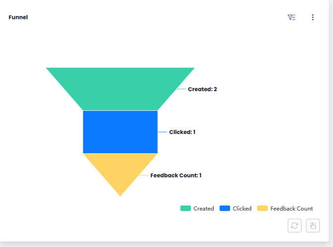
You can now configure the report using the available tabs.
What You Can Do Here
Configure Funnel Chart Data
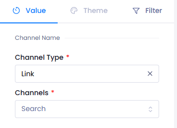
Use the Values tab to select the customer experience data that will be displayed in the Funnel Chart. The selected communication channels determine which journey data appears in the report.
- Open the Values tab.
- Select a Channel Type.
- Choose one of the available communication channels:
- Link
- SMS
- Push Notification
- Web Widget
- Select the Channel field.
- Choose one or more active channels that you want to include in the report.
After you complete these steps, the Funnel Chart displays data from the selected communication channel type and active channels.
Notes
- The Channel field becomes available after you select a Channel Type.
- The Values tab is used to connect the Funnel Chart to customer experience data.
Customize Funnel Chart Appearance
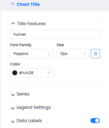
Use the Theme tab to control how the Funnel Chart looks. You can update the chart title, change colors, and configure data labels. A live preview lets you review your changes as you edit the chart.
- Open the Theme tab.
- Expand Title Properties.
- Enter a Graphic Name.
- Customize the title by changing the font, font size, color, or enabling bold formatting.
- Review your changes in the live graphic preview.
- Open the Series section.
- Expand Colors.
- Select the colors you want to use for the chart segments.
- Open the Legend Setting section.
- Toggle Pagination button to split legend items across multiple pages when there are too many to display at once, making the legend easier to read.
- Open the Data Labels section.
- Use the switch in the section header to turn Data Labels on or off.
- If Data Labels are enabled, configure the available settings:
- Select the label Position as Inner or Outer End.
- Select the label Orient as Vertical or Horizontal.
- Customize the label font, font size, and color.
After you save your changes, the Funnel Chart updates with the selected title, colors, and data label settings.
Notes
- Changes made in Title Properties appear immediately in the live graphic preview.
- The Series section displays chart segments based on the selected data, such as regional breakdowns or business units.
- Turning off Data Labels hides the performance metrics displayed on the Funnel Chart.
Filter Funnel Chart Data
Use the Filters tab to display a specific subset of customer experience data. You can apply one filter or combine multiple filters to focus on the information you want to analyze.
- Open the Filters tab.
- Select Add Filter.
- Add one or more filters.
- Configure the selected filters using the available categories:
- Assigned Users
- Channel Types
- Channels
- Content Categories
- Feedback Status
- Flows
- Intelligent Tags
- Tags
- Languages
- Feedback Types
- Questions
- Question Options
- Spam Feedback
- Unit Types
- Units
After you apply the filters, the Funnel Chart displays only the data that matches the selected criteria.
Limits / Notes
Keep the following points in mind while working with Funnel Charts:
- Use the Values tab to connect customer experience data to the chart.
- Use the Theme tab to control the chart layout and visual appearance.
- Use the Filters tab to display a specific subset of customer experience data.
FAQs
Why can't I select a channel?
The theme field becomes available after you select a Channel.
Why can't I select a theme?
The theme field becomes available after you select a Channel Type.
Can I apply more than one filter to a Funnel Chart?
Yes. You can apply multiple filters at the same time to narrow the displayed data.