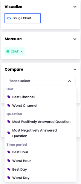
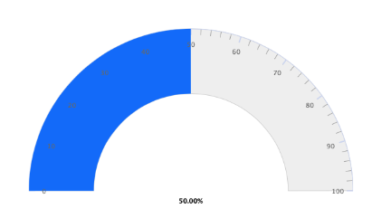
In the gauge chart, the metrics such as CSAT and NPS can be displayed.
As in the example below, if you select
- Visualize > Gauge Chart,
- Measure > CSAT,
- Compare > Best Channel
you will see the highest CSAT score among all the nodes (channels and units) in the account.