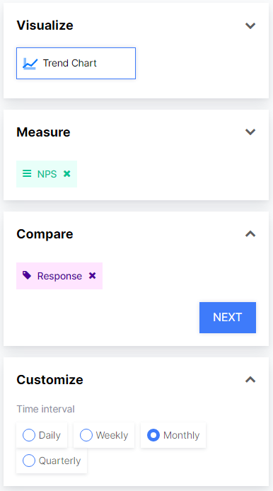
In the Reports module, you can use Trend Chart to show your data such as CSAT, NPS, and Feedback Count by their daily, weekly, monthly, and quarterly results. In this way, you can view whether there is a decrease or increase in your results between the periods you have chosen, and if there is a decrease, you can access the feedback details and take the actions you wish.
To set up your Trend graph;
- Select Trend Chart from Visualize
- Select the data you wish to measure from Measure, such as NPS.
- Select what you want to compare, for example, if you want to compare the responses of different questions you should select ''Response''.
The following example shows the monthly trend of the NPS score of the selected survey.
The numbers 1-6 show the months (January-June)
To Slecevt the Flows you wish to compare:
- Choose the flow from the Filter section.
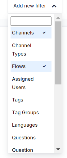
- Select the Flow from the drop-down menu and create your widget.

If you wish to visualize your NPS distribution, follow the below steps.
- Go to the Reports module to open the report you want to create the widget for. Click the Create Custom Widget button.
- Select Trend Chart from Visualize.
- Select Feedback Count from Measure.
- Click on Tag Name from Compare.
- By clicking the Add New Filter button, add the "Flows" and "Tags" filters and select the desired flow.
- In the Tags filter, under the NPS group, select Promoter, Detractive, and Neutral tags.
- Create your new widget by clicking Create Widget button.
The widget you have prepared will appear on your report page. You can set the date settings in Advanced View through the widget and in Basic View, you can set the date settings across the report.-1.png?width=607&height=571&name=MicrosoftTeams-image%20(49)-1.png)